
View More
Articles
- 5 Label Material Myths, Debunked
- When To Add 811 Reminders To Safety Products
- What Are Low-Temperature Adhesives?
- Custom Solutions For Transmission Tower Marking
- String, Wire, Or Nylon Cable? Choose The Right Tie
- The Best Materials For Fleet Marking
- The Most UV-Resistant Label Material
- 6 Ways To Make Your Spec More Competitive
- Best Practices For Substation Marking
- Understanding OSHA 1910.269 Tagout Rules
- Adhesive Options For Painted Metal Surfaces
- A History of Zap The Safety Bird
- Requirements Of Photovoltaic System Marking
- 10 Design Tips For LOTO Tags
- Designing Multilingual Messages: What's Required?
- Correctly Specify ANSI Safety Colors
- Your Safety Labels Have A Shelf Life
- Elements Of A Strong Safety Message
- Using Retroreflective Materials For Signs & Labels
Standards & Regulations Content
- Guide To 3M™ 3200 Reflective Sheeting Alternatives
- Guide To ANSI Z535 Compliance For Safety Signs
- 6 Ways To Make Your Spec More Competitive
- Best Practices For Substation Marking
- Understanding OSHA 1910.269 Tagout Rules
- A History of Zap The Safety Bird
- Requirements Of Photovoltaic System Marking
- Designing Multilingual Messages: What's Required?
- Correctly Specify ANSI Safety Colors
- Elements Of A Strong Safety Message
8 Design Tips For Transformer Labels
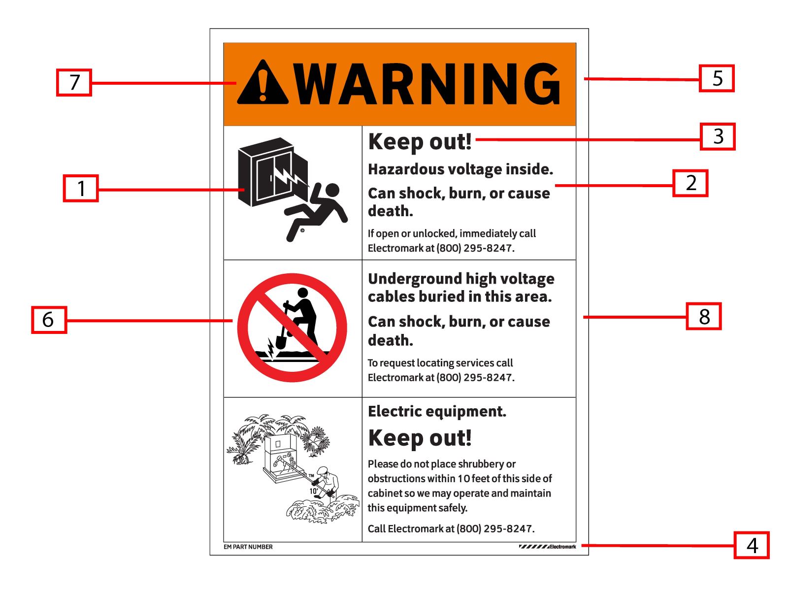
1. Use Shock-In-The-Box
Other symbols such as the current “Mr. Ouch” symbol make electrical hazards into a cartoon, when in fact, electrocution is far from funny. Not only does it play down electrocution, but the cartoon also may not be taken as seriously as other pictograms by adults or older children.
2. Use Clearview Type Font
Clearview type font is more readable compared to others, which is why it’s Electromark’s go to. Most warning labels are approached from an angle (often with less than perfect vision and lighting). Make sure your labels’ messages are clear and readable in any lighting or angle.
3. Show Action Statements First
Put your action statements first and make them parallel. Simply put, a jumbled sign creates a jumbled message. Each sign panel needs to be arranged in parallel sections, with similar starting points and with action statement shown first. For example, “Keep Out!” is the most important message on the sign. It should not be buried in the body of the text.
4. Use Your Logo
Warnings are yet another chance to reinforce your brand. In this age of deregulation, it is important to emphasize your company’s commitment to quality.
5. Use Proven Materials
Electromark is one of the leading manufacturers of transformer labels in the US. We use over-laminated materials, outdoor-tested for over 20 years. Outdoor durability is key. Yet, too often, claims about the durability of the sign as based on salesmanship and not on hard data from the underlying material suppliers.
6. Use Electromark’s Proven ‘Do Not Dig’ Symbol
The test results on the traditional backhoe and shovel symbol are poor – only 82% understood the meaning of this symbol. More importantly, this symbol was rated as having the poorest quality, when compared to other ‘No Dig’ symbols.
7. Order Warnings According To Hazard
The most dangerous hazard should be listed on top, with the lower hazards listed later.
8. Save Money With One Label, Instead Of Three
Having multiple labels not only creates more labor, but it also creates a cluttered look. Save money, time and effort by combining transformer labels into one when applicable.