
View More
Articles
- 5 Label Material Myths, Debunked
- When To Add 811 Reminders To Safety Products
- What Are Low-Temperature Adhesives?
- Custom Solutions For Transmission Tower Marking
- String, Wire, Or Nylon Cable? Choose The Right Tie
- The Best Materials For Fleet Marking
- The Most UV-Resistant Label Material
- 6 Ways To Make Your Spec More Competitive
- Best Practices For Substation Marking
- Understanding OSHA 1910.269 Tagout Rules
- Adhesive Options For Painted Metal Surfaces
- A History of Zap The Safety Bird
- Requirements Of Photovoltaic System Marking
- 10 Design Tips For LOTO Tags
- 8 Design Tips For Transformer Labels
- Designing Multilingual Messages: What's Required?
- Your Safety Labels Have A Shelf Life
- Elements Of A Strong Safety Message
- Using Retroreflective Materials For Signs & Labels
Standards & Regulations Content
- Guide To 3M™ 3200 Reflective Sheeting Alternatives
- Guide To ANSI Z535 Compliance For Safety Signs
- 6 Ways To Make Your Spec More Competitive
- Best Practices For Substation Marking
- Understanding OSHA 1910.269 Tagout Rules
- A History of Zap The Safety Bird
- Requirements Of Photovoltaic System Marking
- 8 Design Tips For Transformer Labels
- Designing Multilingual Messages: What's Required?
- Elements Of A Strong Safety Message
Correctly Specify ANSI Safety Colors
Starting with the 2002 revision, the ANSI Z535.1 Standard for Safety Colors referenced inclusion of the closest Pantone® color number for each of the safety colors; which is provided within the separate but corresponding Z535 Color Chart.
An example, that for safety red, is shown here:

The intention of this inclusion was so that those requiring to know what (i.e.) safety red looks like, or those having no means to compare specific colors using instrument methods, could be provided a tangible and visual reference.
The Conflict
Through our work reviewing customer specifications for safety signs and labels, our team has often observed that Z535’s inclusion of the closest Pantone® color match causes a certain amount of confusion for those needing to specify safety colors.
This is a result of the spec writer’s inclusion of the Pantone® color into their own specification in a well-intended effort to ensure that their signs and labels utilize colors that conform to the Z535 standard.
This inclusion is often practiced alongside the color name in a form such as (i.e.) “ANSI Safety Orange/PMS 152C”, or even as the Pantone® color reference used alone.
This can present a problem for both the printer and the buyer of the print.
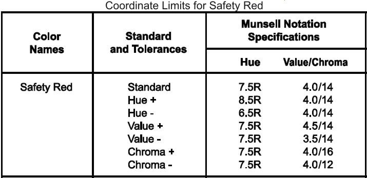
The reason is that the actual Z535 color specifications are provided in terms of the Munsell Notation System; which is a three-dimensional system that defines color in terms of hue, value, and chroma.
But the specification is not a single point in three-dimensional space, but rather it is a window or box within that space defined by +/- coordinate limits in each dimension.
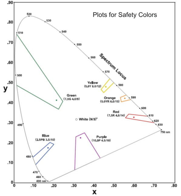
Again as examples, the coordinates for safety red and plots for all the safety colors, are shown here.
So as opposed to there being a very specific color, the Z535 standard actually allows for a range of color that conforms to (i.e.) safety red.
Depending on print methods, consistent color control can be a challenge.
For a printer, it can be very difficult to hit a specific, or ‘single point’ of color without some sort of defined tolerance.
So the inclusion of a specific PMS color number in a customer’s specification without some sort of defined tolerance can leave the printer with a difficult, if not unobtainable, task.
Even if the variation for a specific safety color achieved by the printer conforms within the tolerance ‘window’ defined by the +/- three-dimensional coordinate specifications in the Z535 Standard, the customer’s expectation is that the color is exactly (i.e.) PMS 152C.
If the color doesn’t provide an exact visual match to that PMS color, the customer believes it to be incorrect.
The Right Way To Specify Safety Color
Understanding that the closest matching Pantone® is provided in the Z535 Standard only as a means of tangible visual reference and that the actual specification is a set of coordinates that define a window of tolerance, it is only necessary to cite (i.e.) “ANSI Safety Orange” in your specifications.
There is also no need to copy coordinate limits into your own specification. It is sufficient just to cite the ANSI standard and let it do that work for you.
Be sure you select a printer that specializes in printing safety signs and tags, knows and understands the Z535 standards, and has the color measurement tools and capability to reproduce the safety colors that conform to it.